



fig18
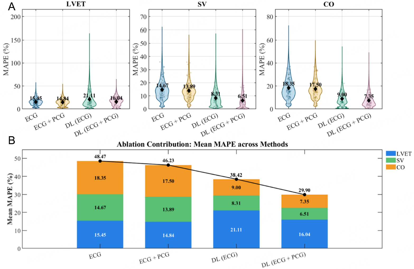
Figure 18. Analysis of metric-wise MAPE distributions and mean error composition for different methods. (A) Violin plots show the beat-level MAPE distributions. (B) Stacked bar charts show the mean MAPE composition of LVET, SV, and CO for each method. Each colored segment represents the mean MAPE of one individual metric. The total value shown above each stacked bar is the sum of the mean MAPE values for LVET, SV, and CO for the corresponding method, and the black line connects these total values across methods.