



fig11
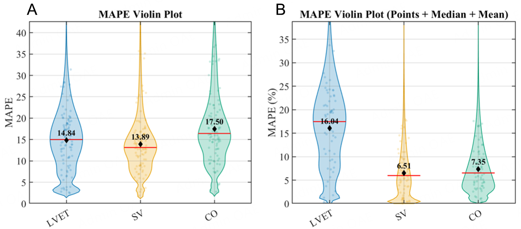
Figure 11. Beat-level MAPE distributions of the best-performing conventional method and the multimodal deep learning fusion method. (A and B) correspond to ECG + PCG-assisted (n = 92) and DL + PCG (n = 61), respectively. Each dot represents an individual valid beat; the width of the half violin indicates the kernel density distribution of MAPE values, the horizontal line represents the median, and the diamond indicates the mean.