fig3
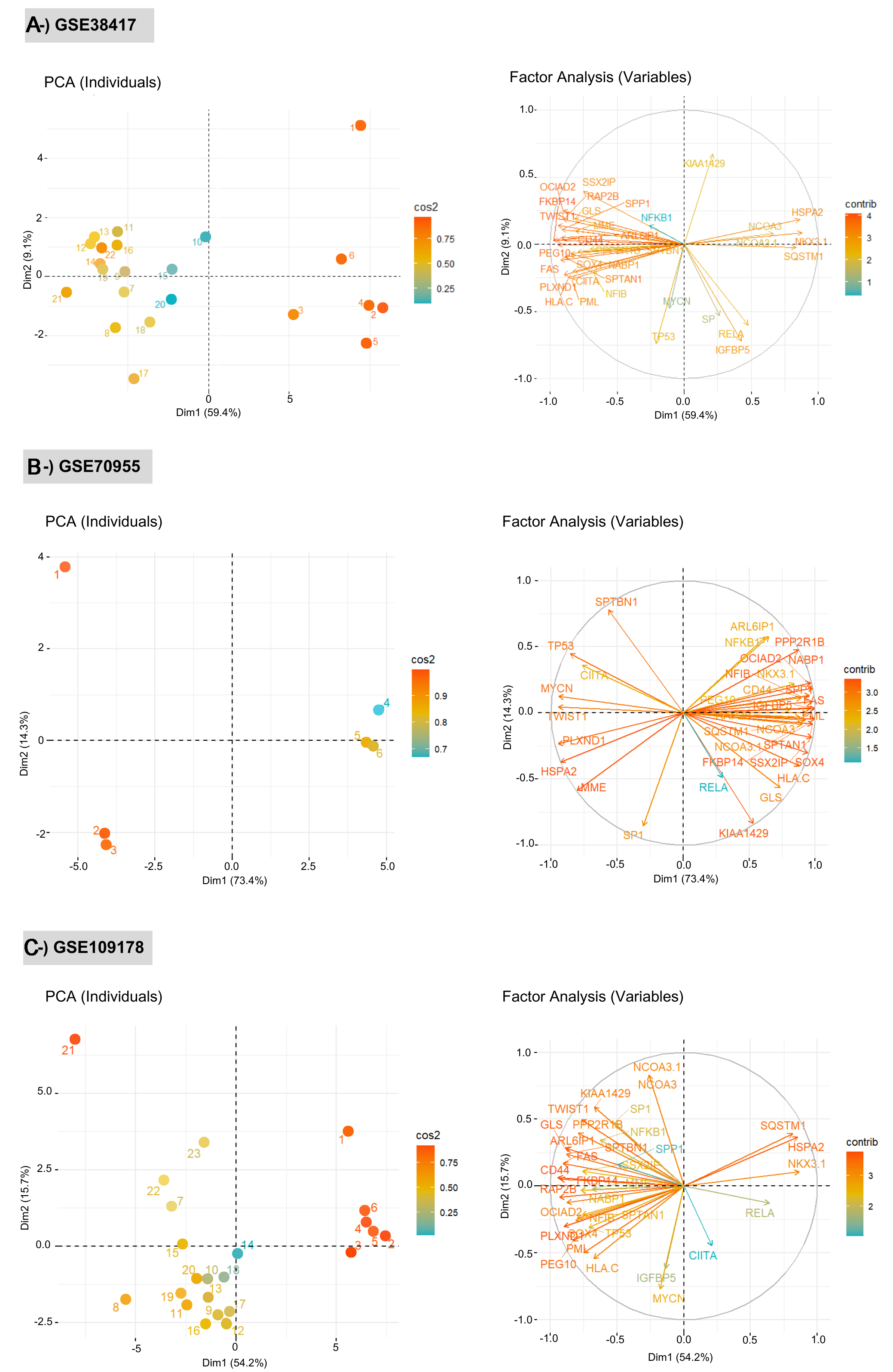
Figure 3. Principal Component Analysis (PCA) plots showing the discrimination of test and control groups for each dataset: (A) GSE38417, (B) GSE70955, and (C) GSE109178. Each panel presents two complementary PCA visualizations: (left) the distribution of individual samples and (right) the contribution of variables (network biomarkers) to the principal components. PCA was performed using limma-normalized gene expression matrices for each dataset, ensuring variance-stabilized and directly comparable values within each cohort. Left plots (PCA of individuals): Samples are projected onto the first two principal components (Dim 1 and Dim 2), with colors representing the cos2 values, which quantify the quality of representation of each sample in the PCA space. Higher cos2 values indicate that a sample is well explained by the selected components, whereas lower values reflect weaker representation. Separation patterns between healthy and DMD samples demonstrate the discriminatory capacity of the network signatures. Right plots (variable factor maps): Arrows correspond to individual biomarker genes, and their directions and lengths indicate the strength and orientation of each gene’s contribution to the PCA axes. The color gradient encodes the cos2 values, highlighting the variables that most strongly drive the variance structure. Longer vectors with high cos2 values represent biomarkers with greater influence on sample separation. The correlation circle delineates the multidimensional structure of gene-gene relationships within each dataset. DMD: Duchenne muscular dystrophy.